Hello, Pythonistas Welcome Back. Today we will see how to make a fully functional modern slider in CustomTkinter.
We will use the CTkSlider Widget.
Contents
How Does CTkSlider Look?
Basic Code
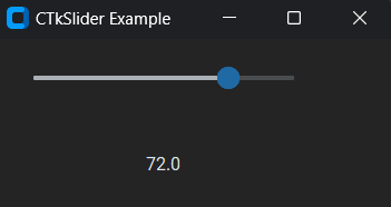
This is how you can make a simple Slider in CustomTkinter (or CTk).
# Importing necessary module
from customtkinter import CTk, CTkSlider, CTkLabel
# Creating an App class that inherits from CTk (Custom Tkinter)
class App(CTk):
    def __init__(self):
        super().__init__() # Calling the constructor of the superclass (CTk)
        self.title("CTkSlider Example")

        # Creating a CTkSlider instance within the window
        self.se = CTkSlider(self, from_=0, to=96,number_of_steps=4, command=self.slider_event)
        self.se.grid(row=0, column=0, padx=20, pady=20)

    # method to display the current value of the slider
    def slider_event(self, value):
        self.l = CTkLabel(self, text=f"{value}")
        self.l.grid(row=1, column=0, padx=20, pady=20)

app = App()
app.mainloop()
Like any other widget in CTk, it is created and then pushed to the window.
As it is like a button you can give it a command function to shoot when you drag the slider.
The from_ is for the start value, to is for the end value, and number_of_steps determines how many points it will have.
It takes a compulsory argument master. This will specify where it will stay.
A Sample Modern Slider
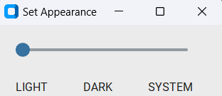
We will make a simple slider that enables you to select one of the three modes of appearance: light, dark, or system.
We need to:
- Make a slider that has values from 1 to 3, set the number of steps to 2, and connect it to a function that will catch its value and change the theme accordingly.
- Now, create three labels so that the user can understand which option they have selected.
- Finally, create a function that will have a dictionary of modes and will select a particular mode based on that value.
That’s it!
Complete Source Code(Click Here For Complete Source Code)
# Import necessary components from customtkinter library
from customtkinter import CTk, CTkSlider, CTkLabel, set_appearance_mode
# Create a class named App which inherits from CTk class
class App(CTk):
    # Initialize the App class
    def __init__(self):
        super().__init__() # Initialize the parent class (CTk)
        self.title("Set Appearance")  # Set the title of the GUI window as "Set Appearance"

        # Create a slider widget for selecting colors with specific parameters and attach a command to it
        self.colorSelector = CTkSlider(self, from_=1, to=3, number_of_steps=2, command=self.change_theme)
        self.colorSelector.grid(row=0, column=0,columnspan=3, padx=20, pady=20)

        # Create labels for different color themes and place them in specific grid positions
        self.green = CTkLabel(self, text="LIGHT")
        self.green.grid(row=1, column=0, padx=20)
        self.blue = CTkLabel(self, text="DARK")
        self.blue.grid(row=1, column=1, padx=20)
        self.dark_blue = CTkLabel(self, text="SYSTEM")
        self.dark_blue.grid(row=1, column=2, padx=20)

    # Function to change the theme based on the value selected in the slider
    def change_theme(self, value):
        # Mapping of slider values to color themes
        col = {1:"light", 2:"dark", 3:"system"}
        # Set the appearance mode based on the selected value
        set_appearance_mode(col[int(value)])

app = App()
app.mainloop()
All Configurations
| Argument | Value |
|---|---|
| master | root, tkinter.Frame or CTkFrame |
| command | callback function, receives slider value as argument |
| variable | tkinter.IntVar or tkinter.DoubleVar object |
| width | slider width in px |
| height | slider height in px |
| border_width | space around the slider rail in px |
| from_ | lower slider value |
| to | upper slider value |
| number_of_steps | number of steps in which the slider can be positioned |
| fg_color | foreground color, tuple: (light_color, dark_color) or single color |
| progress_color | tuple: (light_color, dark_color) or single color or “transparent” |
| border_color | slider border color, tuple: (light_color, dark_color) or single color or “transparent”, default is “transparent” |
| button_color | color of the slider button, tuple: (light_color, dark_color) or single color |
| button_hover_color | hover color, tuple: (light_color, dark_color) or single color |
| orientation | “horizontal” (standard) or “vertical” |
| state | “normal” or “disabled” (not clickable) |
| hover | bool, enable/disable hover effect, default is True |
I am not going to give any challenges at the end of such articles as they are just for your quick reference.
Note I haven’t included all the methods and attributes. You can always get that on the documentation.