Hello Pythonisatas, welcome back. Let’s create a pie chart using Matplotlib in Python.
Contents
How to Create a Pie Chart using Matplotlib
To create a pie chart like the one below:
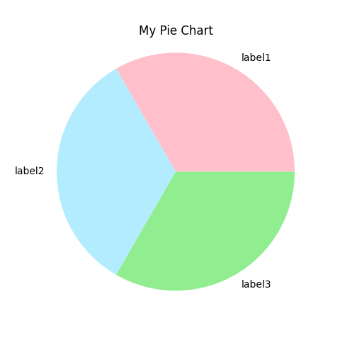
- Install and Import Matplotlib’s pyplot module
- Then create a list of data, a list of labels, and a list of colors
- Now plot the values using the pie method.
- Provide this chart: a title and then using the show() method plot the chart.
import matplotlib.pyplot as plt

my_data = [30, 30, 30]
my_labels = ["label1", "label2", "label3"]
c = ['pink', '#b3ecff', '#90EE90']

plt.pie(my_data, labels=my_labels, colors=c)

plt.title("My Pie Chart")

plt.show()
What Is Explode In Pie Chart Python?
Maybe you want one or more parts of this pie chart to show up highlighted like this:
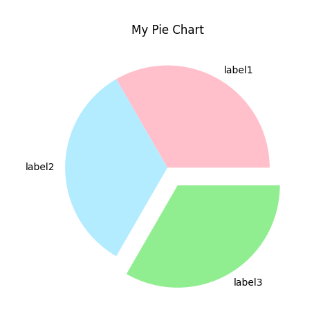
To create an exploded chart like this:
- Create a list of explode values.
- Add this list to the pie() method
import matplotlib.pyplot as plt

my_data = [30, 30, 30]
my_labels = ["label1", "label2", "label3"]
c = ['pink', '#b3ecff', '#90EE90']
myexplode = [0, 0, 0.2]

plt.pie(my_data, labels=my_labels, colors=c, explode=myexplode)

plt.title("My Pie Chart")

plt.show()
How do I add percentages to a pie chart in Matplotlib?
You might want to show the percentage occupied by each part like this:
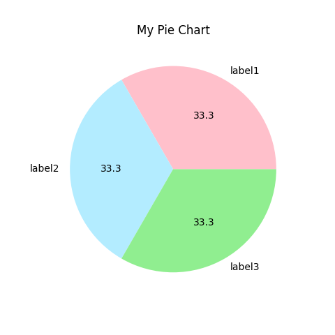
Here’s how you add the percentage here:
- Add
autopctattribute then, provide the format in which you want to display. - %1.1f means floating point value with 1 decimal point.
import matplotlib.pyplot as plt

my_data = [30, 30, 30]
my_labels = ["label1", "label2", "label3"]
c = ['pink', '#b3ecff', '#90EE90']

plt.pie(my_data, labels=my_labels, colors=c, autopct="%1.1f")

plt.title("My Pie Chart")

plt.show()