Hello, Pythonistas Welcome Back. Today we will see how to make a fully functional modern switch in CustomTkinter.
We will use the CTkSwitch Widget.
Contents
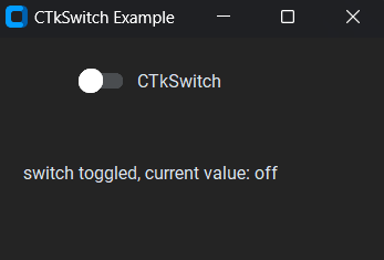
How Does CTkSwitch Look?
Basic Code
This is how you can make a simple switch in CustomTkinter (or CTk).
# Importing necessary module
from customtkinter import CTk, CTkSwitch, CTkLabel, StringVar
# Creating an App class that inherits from CTk (Custom Tkinter)
class App(CTk):
    def __init__(self):
        super().__init__() # Calling the constructor of the superclass (CTk)
        self.title("CTkSwitch Example")

        # Creating a CTkSwitch instance within the window
        # Along with a variable to keep track of its value
        self.switch_var = StringVar(value="on")
        self.se = CTkSwitch(self, command=self.switch_event,
                                variable=self.switch_var,
                                onvalue="on", offvalue="off")
        self.se.grid(row=0, column=0, padx=20, pady=20)

    # method to display the current value of the switch
    def switch_event(self):
        get = self.switch_var.get()
        self.l = CTkLabel(self, text=f"switch toggled, current value: {get}")
        self.l.grid(row=1, column=0, padx=20, pady=20)

app = App()
app.mainloop()
Like any other widget in CTk, it is created and then pushed to the window.
As it is like a button you can give it a command function to shoot when you toggle the switch.
We need StringVar or IntVar to keep track of its value.
onvalue and offvalue are the once you can get using the get() method when the respective event is triggered.
It takes a compulsory argument master. This will specify where it will stay.
A Sample Modern Switch
We will make a bulb on-off functionality using a switch.
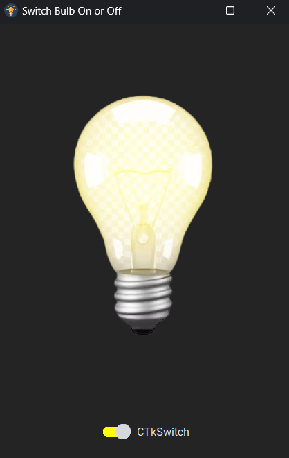
Image resources:
We need to:
- Set an icon.
- Get Both the images
- Create a string variable and a switch.
- Create a function that gets the current value of button and then create a label having the image accordingly.
That’s it!
Complete Source Code(Click For Complete Source Code):
# Importing necessary module
from customtkinter import CTk, CTkSwitch, StringVar, CTkImage, CTkLabel
from PIL import Image
# Creating an App class that inherits from CTk (Custom Tkinter)
class App(CTk):
    def __init__(self):
        super().__init__() # Calling the constructor of the superclass (CTk)
        self.title("Switch Bulb On or Off")
        # Setting window icon
        self.iconbitmap("images\\light.ico")

        # Bulb on and off images
        self.on_img = CTkImage(light_image=Image.open("images\\bulb_on.png"),size=(300,400))
        self.off_img = CTkImage(light_image=Image.open("images\\bulb_off.png"),size=(300,400))
        # Creating a CTkSwitch instance within the window
        # Along with a variable to keep track of its value
        self.switch_var = StringVar(value="on")
        self.se = CTkSwitch(self, command=self.switch_event,
                                variable=self.switch_var,
                                onvalue="on", offvalue="off",
                                progress_color="yellow")
        self.se.grid(row=1, column=0, padx=20, pady=20)

    # method to change the image based on the current value of the switch
    def switch_event(self):
        get = self.switch_var.get()
        if get=="on":
            self.il = CTkLabel(self, image=self.on_img, text="")
            self.il.grid(row=0, column=0, pady=20, padx=20)
        elif get == "off":
            self.il = CTkLabel(self, image=self.off_img, text="")
            self.il.grid(row=0, column=0, pady=20, padx=20)


app = App()
app.mainloop()
All Configurations
| Argument | Value |
|---|---|
| master | master widget |
| width | width of complete widget in px |
| height | height of complete widget in px |
| switch_width | width of switch in px |
| switch_height | height of switch in px |
| corner_radius | corner radius in px |
| border_width | box border width in px |
| fg_color | foreground (inside) color, tuple: (light_color, dark_color) or single color |
| border_color | border color, tuple: (light_color, dark_color) or single color or “transparent” default is “transparent” |
| progress_color | color of switch when enabled, tuple: (light_color, dark_color) or single color or “transparent” |
| button_color | color of button, tuple: (light_color, dark_color) or single color |
| button_hover_color | hover color of button, tuple: (light_color, dark_color) or single color |
| hover_color | hover color, tuple: (light_color, dark_color) or single color |
| text_color | text color, tuple: (light_color, dark_color) or single color |
| text | string |
| textvariable | Tkinter StringVar to control the text |
| font | button text font, tuple: (font_name, size) |
| command | function will be called when the checkbox is clicked or .toggle() is called |
| variable | Tkinter variable to control or read checkbox state |
| onvalue | string or int for variable in checked state |
| offvalue | string or int for variable in unchecked state |
| state | “normal” (standard) or “disabled” (not clickable) |
I am not going to give any challenges at the end of such articles as they are just for your quick reference.
Note I haven’t included all the methods and attributes. You can always get that on the documentation.


